
Cloning Instagram
I was walking around the house when I was thinking of a way to test my CSS skills. Then I thought about making an Instagram clone, and here I’m going to show you my process.
First I want to say that this is just a clone of the UI of instagram.com and not any functionality of it, I also want to point out that I wanted to see where I could go in just a couple of hours.
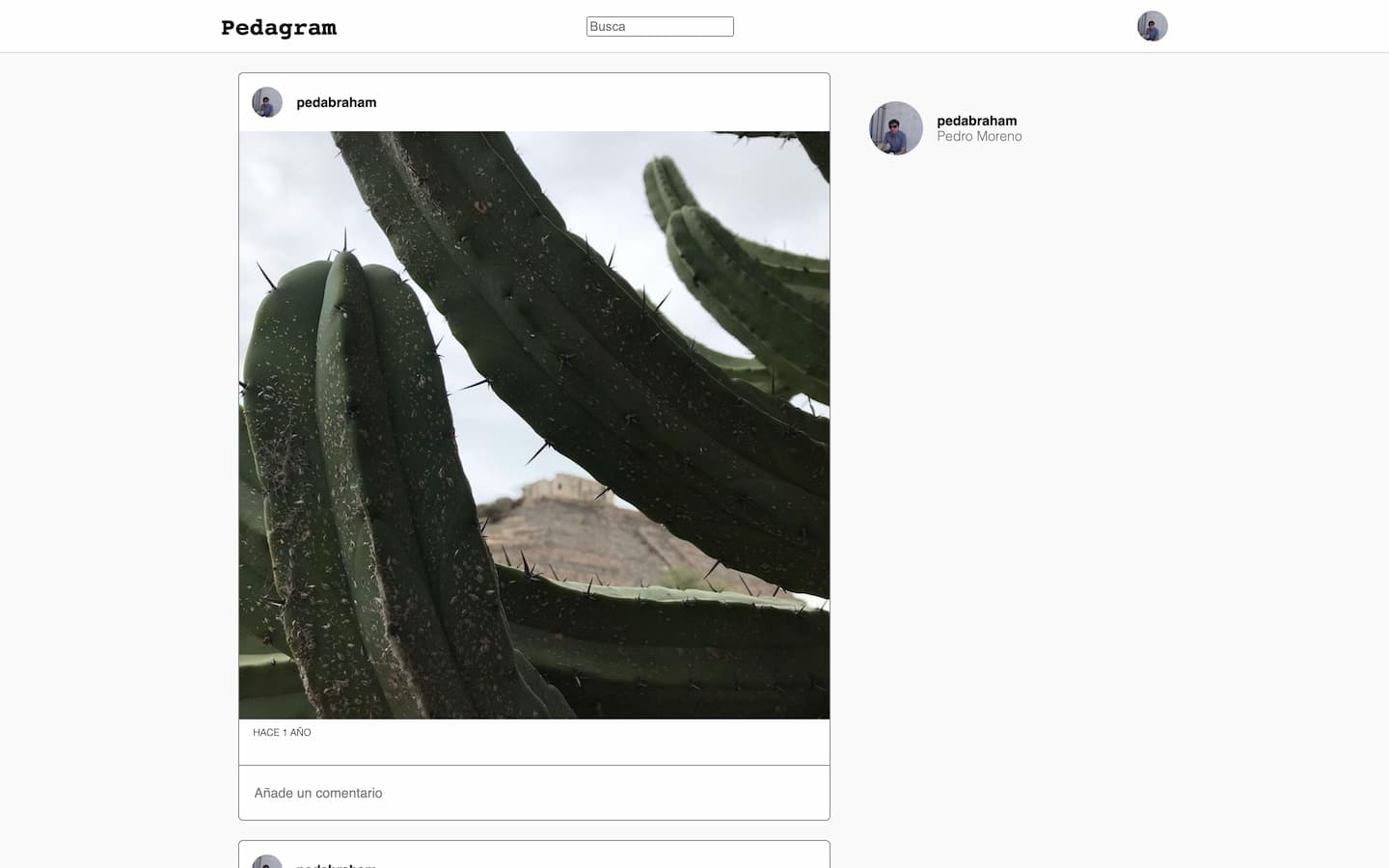
To start, I went to instagram.com and started analyzing the user interface, and saw which elements were inside each other, just making a tree in my head. Then I started writing the HTML, I opened Atom, and described a navbar with a title, an input, and the icons section, to keep control in the HTML, I used classes to name the sections. Then I described the main components in a division named content, inside this I put the feed of photos, and what I called the suggestions section. Inside the feed, I described the posts, with the publisher, the photo, and the info section.
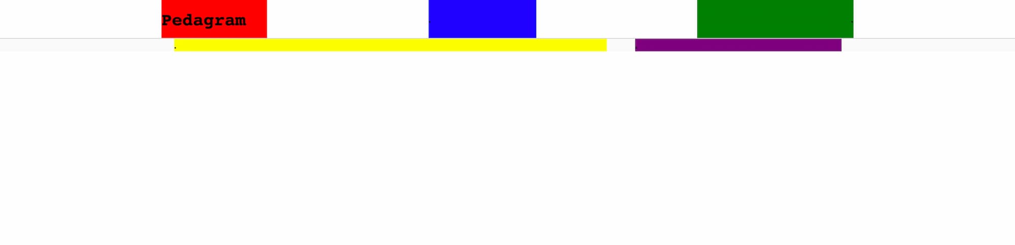
Ok, now was CSS time, first of all, I described all the layout, In this case, I used a Grid. In every major section, or block that goes in the grid, I used bright primary colors to make great contrast between sections, so I could find, errors in an easy way, and this time this was not the exception, It took me around three tries to get the layout right.
Then I proceeded to the post, and to get some images to use, I went to my own Instagram to get Instagram-worthy pictures. I was not expecting that, get my own photos from Instagram could be difficult, I could not just right-click on the image and then download it. I had to go to the network utility in chrome and take the URL of the image, that the site was using. Still easier than digging into my photo library to get an Instagram-worthy image, though.
When It was time to described the post, I first defined the width and the object-fit of the image, then I advanced to the publisher section, to put my profile picture and I used flex to center the image and the name, I set the paddings, and put some border-radius on the image of the profile.
Then in the info sections, I just put the timestamp and not the whole grid of icons, just because searching and selecting a kind of similar set of icons, would take more time. Next, I defined the weight and color of the legends.
To finalize the post I adjusted its borders, the thick, style, radius, and color.
Later I progressed to the navbar, defined the style of the “logo”, choosing a typeface cool enough to be a logo font, and put a rounded border on the profile picture.
To get to the end of this challenge. I defined the style of the suggestions section. Here I just put the details related to my profile. And with this, I conclude the challenge.
The next day, I started seeing how this could be better, which parts didn’t move at scrolling, and how I could put better constraints at the navbar. This quick clone was far from perfect, but it was interesting to see what I could do in 2 hours.